


DEI Policies
Marco Rubio Orders Return to Times New Roman, Reversing Calibri in New Anti-DEI Directive
The font directive is the latest in a series of actions from the Trump administration aimed at dismantling DEI programs. Recent policy changes include the removal of Martin Luther King Jr. Day and Juneteenth as free national park admission days, replaced instead with President Trump’s own birthday.
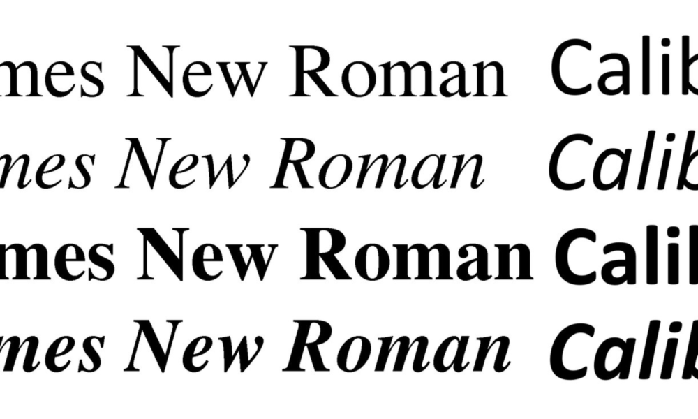
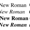
In a move that quickly ignited debate across political, design, and disability-access communities, US Secretary of State Marco Rubio has ordered all diplomats to abandon the Calibri font and return to Times New Roman for official government communications. The directive — part of the Trump administration’s broader rollback of diversity, equity, and inclusion (DEI) initiatives — takes effect immediately and applies to both internal and external documents.
Marco Rubio’s predecessor, Antony Blinken, adopted Calibri in 2023 on the recommendation of the State Department’s diversity and accessibility office. The shift was designed to support individuals with visual disabilities, as sans-serif fonts like Calibri are widely regarded as easier to read on modern screens.
Marco Rubio Blasts Calibri as “Wasteful” in Internal Memo
US Secretary of State criticized the Calibri transition as a “wasteful diversity initiative,” according to an internal cable reported by Reuters. Marco Rubio’s directive states that Times New Roman offers a more “formal and professional” appearance aligned with President Trump’s “One Voice for America’s Foreign Relations” standard.
A State Department spokesperson echoed this, saying that returning to Times New Roman ensures “dignity, consistency, and formality” in government correspondence — especially given that serif fonts continue to be the norm in courts, legislatures, and federal agencies.
The new policy goes further than the Biden-era change, mandating Times New Roman, 14-point, for all diplomatic communications.
Target CEO Steps Down as Sales Slump and DEI Backlash Mounts
Calibri’s Designer Calls the Decision “Sad and Hilarious”
The move drew an emotional reaction from Lucas de Groot, the Dutch designer who created Calibri. Speaking to the BBC, he said the reversal was both “sad and hilarious,” noting that Calibri was specifically designed to improve readability on modern screens — the exact reason it replaced Times New Roman two decades after its introduction.
“Calibri was chosen to replace TNR, the typeface Rubio wants to go back to now,” Lucas de Groot said.
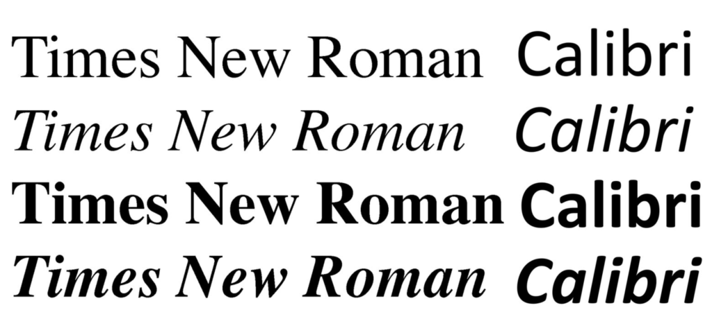
Font War over DEI – Calibri Vs Times New Roman
Accessibility Advocates Express Concern
Disability advocates warn that the change could negatively affect millions. Molly Eagan, CEO of VISIONS, told ABC News that readability is not a cosmetic choice but “essential” for those with low vision or dyslexia.
“Calibri and other sans-serif fonts are widely recommended because they are easier to read for people with visual impairments,” she said, adding that accessibility should remain central to public communication.
A Symbolic Move in a Broader Policy Shift
The font directive is the latest in a series of actions from the Trump administration aimed at dismantling DEI programs. Recent policy changes include the removal of Martin Luther King Jr. Day and Juneteenth as free national park admission days, replaced instead with President Trump’s own birthday.
With the State Department now rewriting its letters, reports, and cables in Times New Roman, the font debate has become a symbol of deeper ideological tensions shaping American governance.